Creating a Power BI dashboard is easy but creating a good dashboard is a skill.
Many beginners overload dashboards with visuals, confusing users instead of helping them. This blog explains Power BI dashboard best practices to help beginners build dashboards that are:
- Clear
- Actionable
- Business-friendly
Why Dashboard Design Matters
A good dashboard:
- Saves decision-making time
- Highlights key metrics
- Tells a clear story
A bad dashboard:
- Confuses stakeholders
- Hides insights
- Reduces trust
Best Practices for Power BI Dashboards
1. Start with Business Questions
Always ask:
- What decision will this dashboard support?
- Who is the user?
2. Choose the Right KPIs
Avoid vanity metrics. Focus on:
- Revenue
- Growth
- Efficiency
- Performance indicators
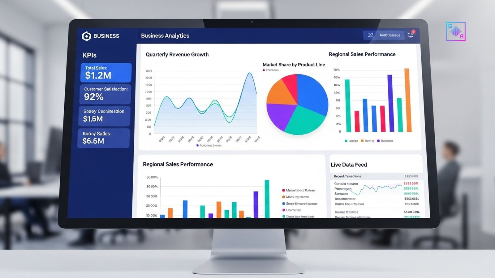
3. Keep Visuals Simple
Use:
✔ Bar charts
✔ Line charts
✔ Tables
Avoid unnecessary visuals.
4. Maintain Visual Consistency
- Same colors for same metrics
- Clear labels
- Logical layout
5. Use Filters & Slicers Wisely
Allow users to:
- Filter by time
- Segment by region
- Drill into details
Common Power BI Mistakes Beginners Make
❌ Too many charts
❌ No clear hierarchy
❌ Poor color choices
❌ Ignoring user perspective
Power BI Dashboard Projects for Beginners
- Sales dashboard
- HR attrition dashboard
- Marketing performance dashboard
Conclusion
Power BI dashboards are not just about visuals they are about decision-making.
Following best practices helps beginners build dashboards that impress recruiters and stakeholders alike.